Branding agency in Dubai. Where the logo is just the start
Most agencies hand you a nice mark and call it a brand.
But a logo on its own does very little. What actually builds a business is the whole identity working together. How you look, how you sound, what you stand for and how consistent you are everywhere a customer meets you. As a branding agency in Dubai, ebs Digital builds all of it, not just the part that fits on a business card.
What branding
really means.
Branding is the full picture of how your business shows up in the world. It is built from a few things that have to work together.
- Strategy
- Who you are, what you stand for and what makes you different from everyone else in your market.
- Identity
- Your logo, your colours, your type and your imagery working as one clear look.
- Voice
- The way you speak, so you sound like the same company in an ad, an email and a reply.
- Guidelines
- The rules that keep it all consistent, no matter who is using it.
Full size, full colour, on the ground it was designed for. The easy one.
- The ebs mark: a square divided into sixteen units each way with the letter E cut out of it — a five-unit spine down the left, three-unit top and bottom arms running to the edge, and a four-unit middle arm that stops five units short. Two values, no curve, no radius and no gradient. Sixty-six per cent ink to thirty-four per cent paper.
- As presented — Full size, full colour, on the ground it was designed for. The easy one. Every vertex lands on the sixteen-unit grid. Nothing here is drawn by eye.
- At sixteen pixels — A browser tab, an app icon, a favicon. Detail you were proud of disappears here. Rendered at sixteen CSS pixels — measured, not simulated. The mark's own construction grid IS the favicon grid, and nothing in it is thinner than three of its sixteen units.
- In one colour — An invoice, a fax from a supplier, an embroidered polo shirt. No gradients survive. Not one boundary moves. Colour is carried by the field and never by an edge, so removing it removes nothing that was holding the drawing together.
- Knocked out — On dark, where half of everything now lives. A mark that only works on white is half a mark. Values swapped: 66% ink becomes 66% paper. No counter is narrower than an arm, so the negative weighs what the positive weighed.
- Cropped by somebody else — A platform squares your header without asking. What is left has to still be you. The mark bleeds to its own tile edge, so a crop has no outer margin to take. What survives is the notch and both counters — the same rhythm, without the letter.
- On a photograph nobody art-directed — Taken on a phone, in a hurry, by a franchisee. This is where clear space earns its fee. The mark is opaque and carries its own field, so the photograph meets its edge and never enters it. The one-unit keyline is the clear-space rule made visible.
Get these right and your brand does the heavy lifting for you. People know you at a glance and trust you faster. That is what a real branding project delivers, and it is what most logo jobs miss.
16 × 16 grid · minimum feature 3 units · two values · no radius, no curve, no gradient
Every vertex lands on the sixteen-unit grid. Nothing here is drawn by eye.
A brand is a system, not a picture.
What makes a brand actually usable is everything around it. A colour palette that works on screen and in print. Type that has a clear order from headings to small print. Spacing and layout rules that mean anyone can build a page and have it still look like you.
The type scale
One hue, eight lightnesses
Not eight colours. Every stop is the same hue moved on lightness only, so a lighter accent is still the brand colour rather than a second orange — and each stop carries its measured contrast, so nobody has to guess which one is legible on white. Each swatch carries its contrast on white, then on black — so 4.5 or better is safe for body text on that ground.
A scale, not a ruler
Every gap on this page is one of eight values. That is what makes a layout somebody else builds look like it belongs to the same company as this one.
This is the part that matters most as a corporate branding project, because your brand is rarely in your own hands. A supplier, a new hire, a printer or a franchisee will all make something with your name on it. A proper system means every one of them gets it right without guessing. That is the difference between a brand that stays sharp and one that slowly falls apart.
A brand has to sound like something too.
A brand is not only what people see, it is what they hear. Your voice is a choice about how you speak, and then sticking to it every time. Here is the same message said three ways.
Corporate
We endeavour to deliver best-in-class solutions according to your needs.
It says nothing and could be any company in the city.
Plain
We build what you need, and we tell you the cost before we start.
Clear, specific, and it still sounds right when your sales team repeats it.
Blunt
If you do not need us, we will tell you on the call.
Bold and memorable, but only right if your whole company will live up to it.
Most brands pick the safe corporate option because it is easy to sign off. The plain one is almost always the right answer, and a good branding partner will help you find yours and hold it.
What you actually get.
A full brand you can use from day one and own completely. Not a folder of files you cannot open without going back to the agency.
- Strategy
The worth
Your positioning, your values and what makes you different, written down clearly.
- One system
The look
Your branding in every version you need, with colours and type as one system.
- 1 document
The transparency
A clear document showing how to use your brand and what never to do.
- 12 files
The templates
Decks, documents, social frames and email signatures, ready in the tools your team already uses.
- Tone of voice
The style
Your tone written down, so it survives every new hire.
- Editable
The source files
Layered, named and organised, in your drive and in your name from the day it is signed off.
You keep all of it whether or not you keep working with us. A brand you cannot use without its agency is not really yours.
What a strong brand
does for you
Built to be used by people who were not in the room when it was made.
01
It works everywhere
Small, large, in colour, in one colour, on screen and in print.
02
Anyone can use it
A system and templates, not a pile of exports to guess from.
03
It sounds like you
A voice written down, so it holds up across every channel.
04
You own all of it
The strategy, the files and the licences, all in your name.
Worked across
fintech · FMCG · hospitality · lifestyle · retail
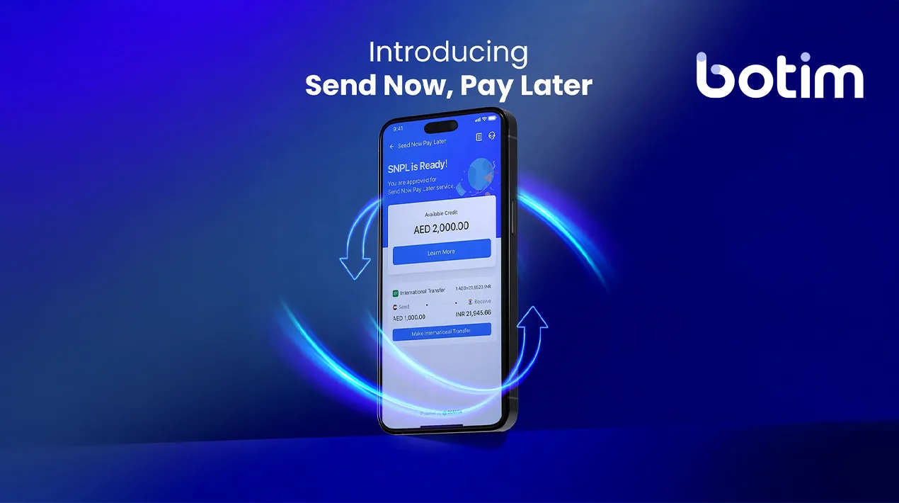
botim
Campaign, motion and social launch for the fintech app.

alshifa
Social and campaign production for the FMCG brand.
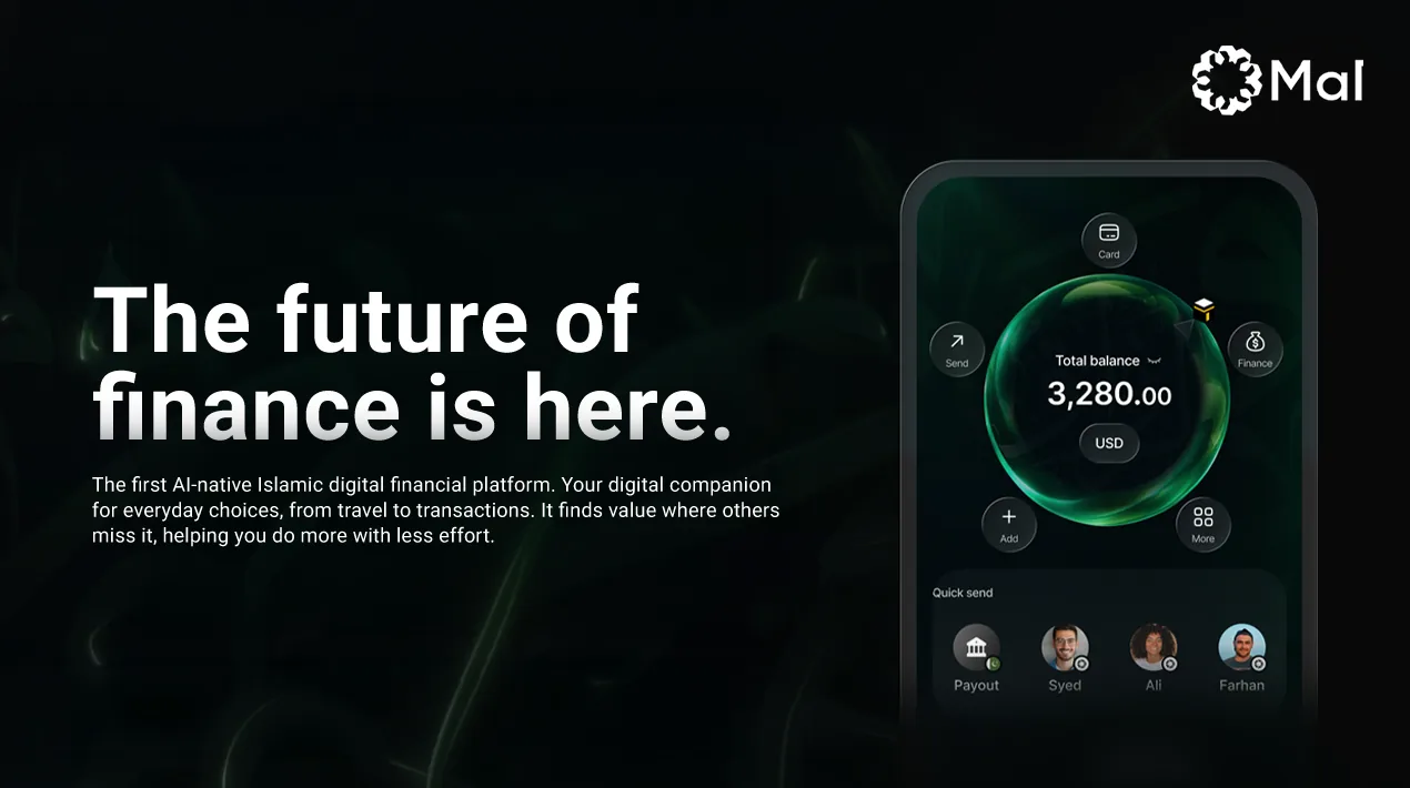
Mal
Product launch, end to end.
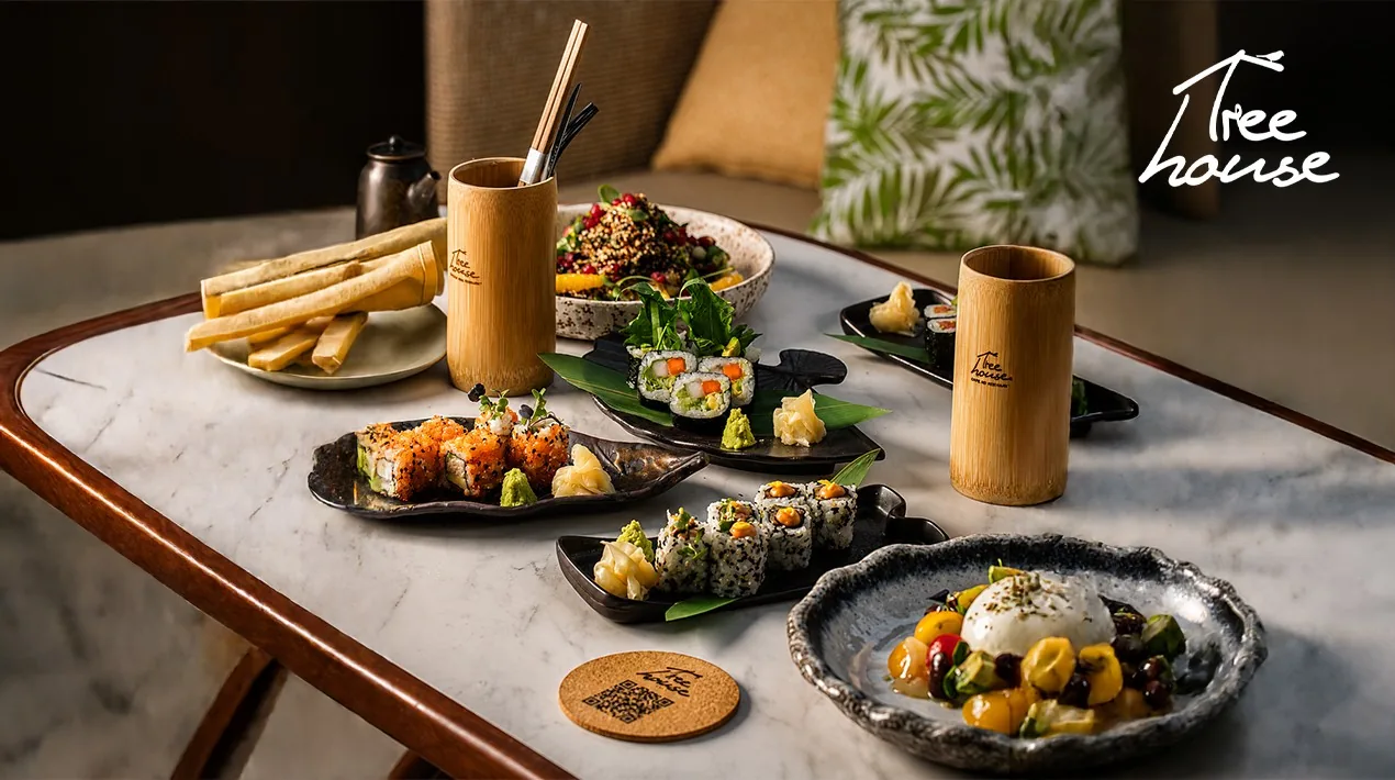
Tree House
Brand and social presence, built from the ground up.

SOL Perfume
Brand and packaging.
Why businesses choose ebs Digital for branding
ebs Digital is a creative branding agency that builds complete brands. The same people who shape your strategy design your identity and write your guidelines, so nothing gets lost or handed to a stranger to finish. We have built and grown brands across fintech, FMCG, hospitality, lifestyle and retail and more, so we know what it takes for a brand to work in the real world and last.
Go deeper
Frequently asked
questions
Our full branding project covers your strategy, your identity, your voice, your guidelines, your templates and all the source files. In short, you get everything you need to look and sound like one clear brand everywhere.
Yes, and often that is the smarter move. If your brand still has value and the real problem is that it is used inconsistently or does not work well, a refresh fixes that for a smaller cost. We will tell you honestly whether a refresh or a full rebrand is right for you.
Yes. We build your brand to work everywhere, from your website and social media to printed invoices, signage and packaging. Your colours and type are set up so they look right on a screen and on paper without any surprises.
Most branding projects take a few weeks to a couple of months, depending on how much you need from strategy through to templates. We give you a clear timeline before we start so there are no surprises along the way.
Yes. Every file is handed over to you and organised in your name from the day it is signed off. The brand is yours to use and own fully, and we will point you in the right direction on registering your trademark.
Still not answered?Ask us directly
What is included in a full branding project?
Our full branding project covers your strategy, your identity, your voice, your guidelines, your templates and all the source files. In short, you get everything you need to look and sound like one clear brand everywhere.
Can you refresh our existing brand instead of starting from scratch?
Yes, and often that is the smarter move. If your brand still has value and the real problem is that it is used inconsistently or does not work well, a refresh fixes that for a smaller cost. We will tell you honestly whether a refresh or a full rebrand is right for you.
Do you design for both digital and print applications?
Yes. We build your brand to work everywhere, from your website and social media to printed invoices, signage and packaging. Your colours and type are set up so they look right on a screen and on paper without any surprises.
How long does a branding project take?
Most branding projects take a few weeks to a couple of months, depending on how much you need from strategy through to templates. We give you a clear timeline before we start so there are no surprises along the way.
Will we own the final files and trademark rights?
Yes. Every file is handed over to you and organised in your name from the day it is signed off. The brand is yours to use and own fully, and we will point you in the right direction on registering your trademark.